Monday, January 16, 2012

Another one for 2012


This one was a request from a buddy's sister. The actual color of the drawing is more like the sepia one but I put it in grayscale when I scanned it also, since it looks nice that way too.

8x10", strathmore 400 drawing paper. Same HB and 3B pencil as well as a B pencil for VARIETY.

Hey, I finally figured out how to draw blonde people! Now there's a milestone.

2012 productivity!


Super detailed realism takes too long. I wanted to finish out the family series of some of my relatives, so I adopted an old-school style of pencil drawing akin to what you'd see artists in the 40s and 50s and I'm pretty happy with it. I still gravitate more towards the detailed rather than the sketchy style, I guess it's just personal habit.

Here's a couple. They only took 2-3 hours apiece and are 8x10" on Strathmore 400 drawing paper. Done almost entirely with an HB leadholder pencil and a 3B regular pencil for the dark parts.

These two kids are siblings. There is one more in the family I need to draw, then the set will be finished.

Wednesday, October 19, 2011

Eric

This was a project I did as a surprise for one of my buddies while he was off at basic training this summer for the National Guard. I hadn't finished a detailed graphite drawing in over a year and I wanted to see if I still had what it took.


Yep.

11x14", Stonehenge paper, graphite. I have no idea how long I worked on this, other than it was longer than strictly necessary. There is some sheen present in the photo.


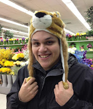
Here he is replicating the pose in my cap.
(You can see one of my old self-portraits in the mirror!)

Friday, June 24, 2011

Squirrel Demonstration


Did this one a while back, figured it would be good to post it here.

I stuck my camera on a microphone stand and recorded myself painting a squirrel in watercolor and condensed it down from about 3 or 4 hours to 11 minutes, which is still a good bit. About half a dozen colors were used: Payne's grey, sepia, Vandyke brown, yellow ochre, burnt sienna, and cobalt blue. Probably a few others.


This is 8x10" on Arches HP watercolor board.


Watch the video on YouTube

Tuesday, May 31, 2011

Nature journal

Ah, it's been almost a year since I updated this poor blog. Let's make this one a good one! I've done a lot of things in the past few months, mostly watercolor paintings since I can do those a bit quicker than drawings.

A while back, I found a cool watercolor sketchbook at Hobby Lobby for around $8... quite a deal, considering it claims to be handmade in India, 100% cotton, and archival. I can dig that.

Naturally, it sat around the house months until I actually picked it up and decided to do something with it.

I figured that the landscape orientation would work well for nature subjects, so I've been painting local birds that I see around the house. Usually I can snap a few shots of them with my camera while they're at the bird feeder but some of the common ones I could probably paint from memory.
All of these are probably a bit more work than simple sketches... more like small paintings, depending on how much time I spend on them.


This fellow is a tufted titmouse. It's painted with Payne's grey, burnt sienna, cobalt blue, and cadmium yellow, as well as black ink.


This is a nice female cardinal at the feeder. She's not quite as vibrant red as the male, but has a wider range of colors overall. I don't remember what colors I used for her, exactly, but a good bit of mixing was involved.

This is a proud, male cardinal! He was perched on top of the feeder and I've snapped many photos of him and his lady over the past few weeks. He's painted with cadmium red, burnt sienna, viridian, cobalt blue, and some black ink.

This is a juvenile brown-headed cowbird. This was the first one I did. I drew in the outline of the bird with an inkpen and painted over it... this one has more of an illustrative look to it.

Saturday, July 17, 2010

Summer/Spring Stuff pt. 1

Haven't posted much in a while.

I moved all the writing, recipes, and music related stuff to another blog. This one is now designated purely as an art blog. This makes it easier to keep both things organized and is easier to read.


The Beta Position

So, without further ado, here is some art!

German Field Marshall Erwin Rommel. He came out rather well, I think.

The clothes and hat are done with General's Primo Euro-Blend charcoal sticks and pencils, and the skin is drawn with Wolff's carbon pencils. I use them similar to how I would a graphite pencil - gentle, slow circles to make the skin texture and tone. It's pretty easy; easier than I expected considering that I've never really used them much before.

He's the first in a multi-part series consisting of Rommel, Patton, Montgomery, Omar Bradley, and others (to be determined).


Self portraits rock. I love doing self portraits.

This is 8x8" in graphite and took between 16-22 hours... which makes me lightning fast compared to many artists! (Albeit not as reliable as far as actually FINISHING things!)

I like Tombow pencils. They're fantastic as far as pencils go, really smooth. Not as black as General's, but SMOOTH. Another example of great Japanese quality! Staedler's another good brand I wish I had more pencils of. Along with super nice knives, Germany produces some of the finest art implements I've ever had the pleasure of using.


Ah. As of this posting, I have 3 day left to do an 11x14" drawing for a wedding... better get at it!

Sunday, May 2, 2010

Mark Harmon


I found three illustration board pieces that I'd cut up a while back and figured I'd make use of them.

Illustration board's not the most permanent medium (The paper on the Crescent 310 board I use is 100% cotton and acid free, but the gray-core board isn't quite so good.) but it works well for ink so that's what I use. I use a TON of water, and illustration board is the only surface that can handle it besides watercolor blocks. Clayboard would too, I suppose, but it's more expensive.

Crescent Premium watercolor board is the archival stuff: it has a white core. 

I took two scans. The first is about 1/3 of the way through, the 2nd is finished.


Mark himself is done in sepia ink. The background and shirt are black ink.

The wash method I use isn't exactly common. From what I understand, ink & wash was very popular earlier in the 1900s, but has become somewhat obscure these days. I recall reading about the technique in Rudy de Reyna's "How to Draw What You See" and thinking that it looked just dandy: thin ink with water and brush it on. How much more simple can it get?

The end result looks very much like a watercolor painting although it has very different characteristics:

  • Ink thins with water but it sure doesn't lift like watercolor. Once a layer is dry, it's on for good unless you want to risk damaging the paper scrubbing.
  • Ink handles a little differently. The vehicle for ink isn't gum arabic, so it behaves differently on wet paper. I can't describe it exactly, but if the paper is dry, it doesn't wander. It stays put exactly where you brush it. However, if there's a wet area nearby, you can count on that heavy ink you just laid down to go racing towards it and spread out. For fun, just wet a large area of paper and brush ink wildly throughout it. It spreads out in many interesting ways.
  • It's very easy to layer ink. Since it dries waterproof, each layer goes on without disturbing anything else at all. This is an extremely useful property for tweaking gradients.
  • As ink in a container dries, it thickens and becomes extremely easy to drybrush, much more so than watercolor. This is handy for adding texture to areas and doing hair, wrinkles, etc.

This is probably my favorite method of drawing. It's basically a western version of Sumi-e although I just use a cheap #6 white nylon brush, small script liner, and spotter. Drawing doesn't get much cheaper than that. I honestly believe even plain pencils would cost more in the long run.

I haven't seen it used much for portraiture but it works fine for me.